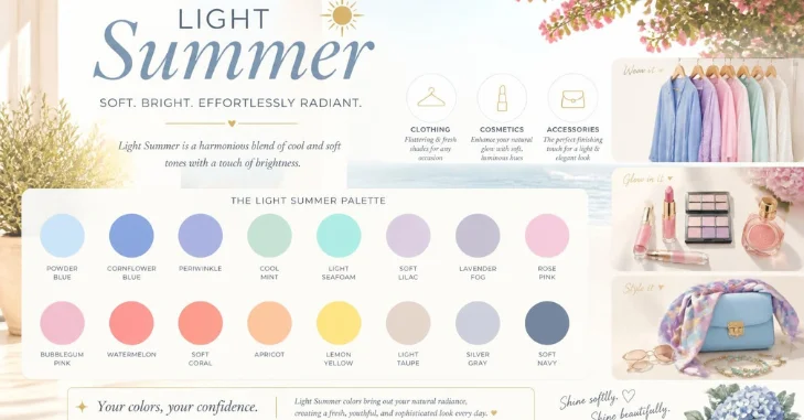
The light summer color palette suits people who look harmonious in cool, light, softly muted shades. Think powder blue, lavender, cool pink, seafoam, and gentle gray instead of black. This guide shows how to use those colors in clothes, makeup, jewelry, and daily outfits.
Direct answer: Light Summer is a light, cool-neutral, softly muted season in 12-season color analysis. Its easiest colors include powder blue, lavender, cool rose, seafoam, periwinkle, soft white, dove gray, and soft navy. The best outfits keep contrast low and place flattering colors near your face.
| Palette trait | What to look for |
| Temperature | Cool to neutral-cool |
| Value | Light |
| Chroma | Soft to medium-soft |
| Contrast | Low to gentle |
| Best neutrals | Soft white, dove gray, cool taupe, soft navy |
| Best metals | Silver, white gold, platinum, pearls |
| Use carefully | Jet black, optic white, orange, mustard, camel, dark chocolate |
Key Takeaways
- Lead with lightness, then check undertone and softness.
- Choose powdery blues, cool pinks, lavenders, aquas, and softened greens.
- Replace harsh black near the face with soft navy, blue-gray, or cool taupe.
- Test uncertain colors in daylight and compare them side by side.
Light Summer Color Palette: Why This Palette Looks Soft Instead of Washed Out
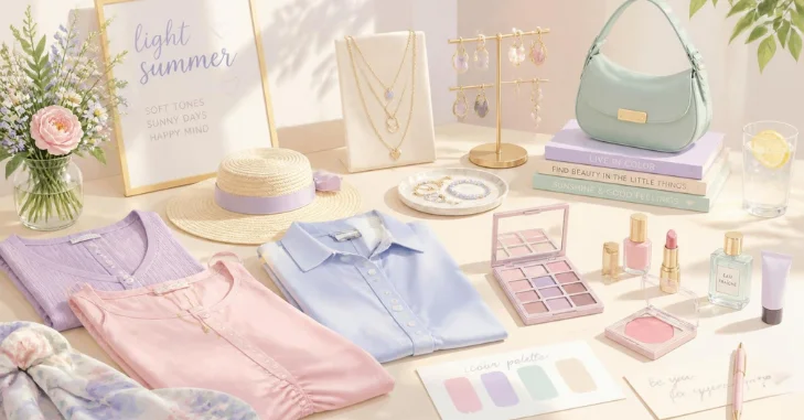
Seasonal color analysis sorts colors by temperature, value, and chroma. The light summer color palette sits on the light side, leans cool, and stays softly saturated. Those traits explain why pale blue can feel balanced while black can feel severe.
Color analysis is a styling system, not a medical or biological classification. Lighting, makeup, hair color, and camera processing can affect self-typing from photos. Use the palette as a practical guide, then trust side-by-side draping in daylight.
24 Best Colors for This Season
Digital swatches make shopping and outfit planning easier, but hex codes are only references. Fabric texture, dye, lighting, and screen settings can change how a shade appears. Focus on the shared qualities of lightness, coolness, and gentle softness.
| Color group | Shade 1 | Shade 2 | Shade 3 |
| Blues | Powder blue #BFD7EA | Sky blue #A2D2DF | Cornflower #7F9FD6 |
| Pinks | Soft pink #E8C4D8 | Dusty rose #D4A5B5 | Soft raspberry #C45C83 |
| Purples | Lavender #C3B1E1 | Periwinkle #9FA8DA | Orchid #C39BD3 |
| Greens | Cool mint #A8DCC8 | Pale sage #B9C6AE | Sea glass #9FB8AD |
| Aquas and teals | Light aqua #8FD3D1 | Soft teal #6FA5A8 | Seafoam #A6D8CE |
| Light accents | Pearl #F0E6EF | Lilac blush #EBD3E8 | Pale blue #DCE9F3 |
| Deeper anchors | Soft navy #4F6384 | Blue-gray #7C8FA6 | Slate blue #607896 |
| Extra accents | Soft watermelon #E3808F | Lemon ice #F1EBA8 | Soft plum #8E6A8E |
Treat the table as a starting point, not a strict shopping card. A garment can work without matching a code exactly. If the color stays light, cool enough, and softly muted, it can still fit the palette.
Best Neutrals and Easy Outfit Formulas
Soft navy, cool gray, cool taupe, and light denim make practical wardrobe anchors. They create less contrast than black, espresso, or dark indigo near the face. Pair them with pastels for outfits that look intentional without becoming sugary.
| Situation | Easy color formula | Why it works |
| Office | Powder blue + cool gray + silver | Polished with gentle contrast |
| Weekend | Seafoam + light denim + soft white | Fresh and easy to repeat |
| Brunch | Cool pink + pearl + blue-gray | Colorful without sharp contrast |
| Wedding guest | Lavender + soft navy + pearl | Dressy while staying light |
| Evening | Soft plum + dove gray + silver | Adds depth without heavy black |
For more warm-weather combinations, browse these effortless summer outfit ideas. The same formulas also work during cooler months with knits and coats. Personal color is about your coloring, not the temperature outside.
How to Know if the Light Summer Color Palette Fits You
Start by testing the full effect, not just one feature like hair or eye color. Light hair or blue eyes alone cannot determine a season. Look for harmony when cool, pale colors sit close to your face.
Compare powder pink with peach, then compare silver-gray with warm camel. Notice which side makes skin look clearer and facial shadows less obvious. Repeat the test in indirect daylight without strong makeup or colored lighting.
| Season | Main quality | Useful test colors |
| This palette | Light, cool, softly muted | Powder blue, cool pink, lavender |
| Light Spring | Light, warm, clearer | Peach, coral, butter yellow |
| True Summer | Cool first, slightly deeper | Rose, denim blue, cool berry |
| Soft Summer | Muted first, slightly deeper | Dusty mauve, blue-gray, muted teal |
Colors to Use Carefully
Jet black, warm orange, mustard, camel, and deep chocolate often fight this palette. They are darker, warmer, or more saturated than the season usually handles well. That does not mean you must remove them from your closet.
Keep difficult shades farther from your face when you still enjoy wearing them. Black trousers can work with a powder blue shirt or a cool pink scarf. A soft neckline color reduces the sharp contrast darker pieces create.
Makeup, Jewelry, and Hair That Stay in Harmony
Keep makeup soft, cool, and lightly defined. Try rose or cool pink blush, mauve or berry lips, and taupe or soft plum eyeshadow. Defashionz has more makeup looks for coordinating color with clothing.
Silver, white gold, platinum, and pearls usually echo the palette better than strong yellow gold. Hair colors often look most harmonious when they avoid heavy warmth or extreme darkness. Ash blonde, beige blonde, and cool light brown are useful references for a colorist.
Build a Practical US-Friendly Capsule Wardrobe
Start with two soft neutrals and three accent colors you already enjoy wearing. Add tops first because colors near your face have the strongest visual effect. Then use denim, trousers, skirts, shoes, and bags to support the same color story.
A small capsule could use soft navy trousers, light denim, a powder blue shirt, and a lavender knit. Add a seafoam top, soft white sneakers, and silver jewelry for easy rotation. Use these seasonal outfit ideas when you want more combinations.
For dressier plans, choose one flattering color and keep the accessories quieter. Lavender, cool pink, and blue-gray work well for showers, brunches, and daytime celebrations. The site’s tea party outfit ideas offer useful silhouette inspiration.
Frequently Asked Questions
What colors are in the Light Summer Color Palette?
The core colors include powder blue, cool pink, lavender, periwinkle, mint, seafoam, and soft rose. Useful neutrals include soft white, dove gray, cool taupe, and soft navy. The strongest choices stay light, cool-leaning, and softly muted.
Can you wear black?
You can wear black, especially away from your face. Near the neckline, it may create more contrast than softer coloring can balance. Try soft navy, blue-gray, or charcoal-blue when you want a gentler dark neutral.
How is it different from Light Spring?
Both palettes are light, but their temperature differs. Light Spring leans warm and favors peach, coral, and warmer aqua. This season leans cooler and favors powder blue, lavender, and cool pink.
Is this palette only for blonde hair?
No single hair color determines a seasonal palette. Someone with light brown hair can still suit these colors if the total coloring stays light and cool. Compare drapes around the face instead of relying on hair labels.
Which jewelry metals work well?
Silver, white gold, platinum, and pearls usually fit the cool, delicate color story. Softer rose gold can also work when it does not read strongly orange. Use your skin response in daylight as the final check.